Client requested updated branding and brochure


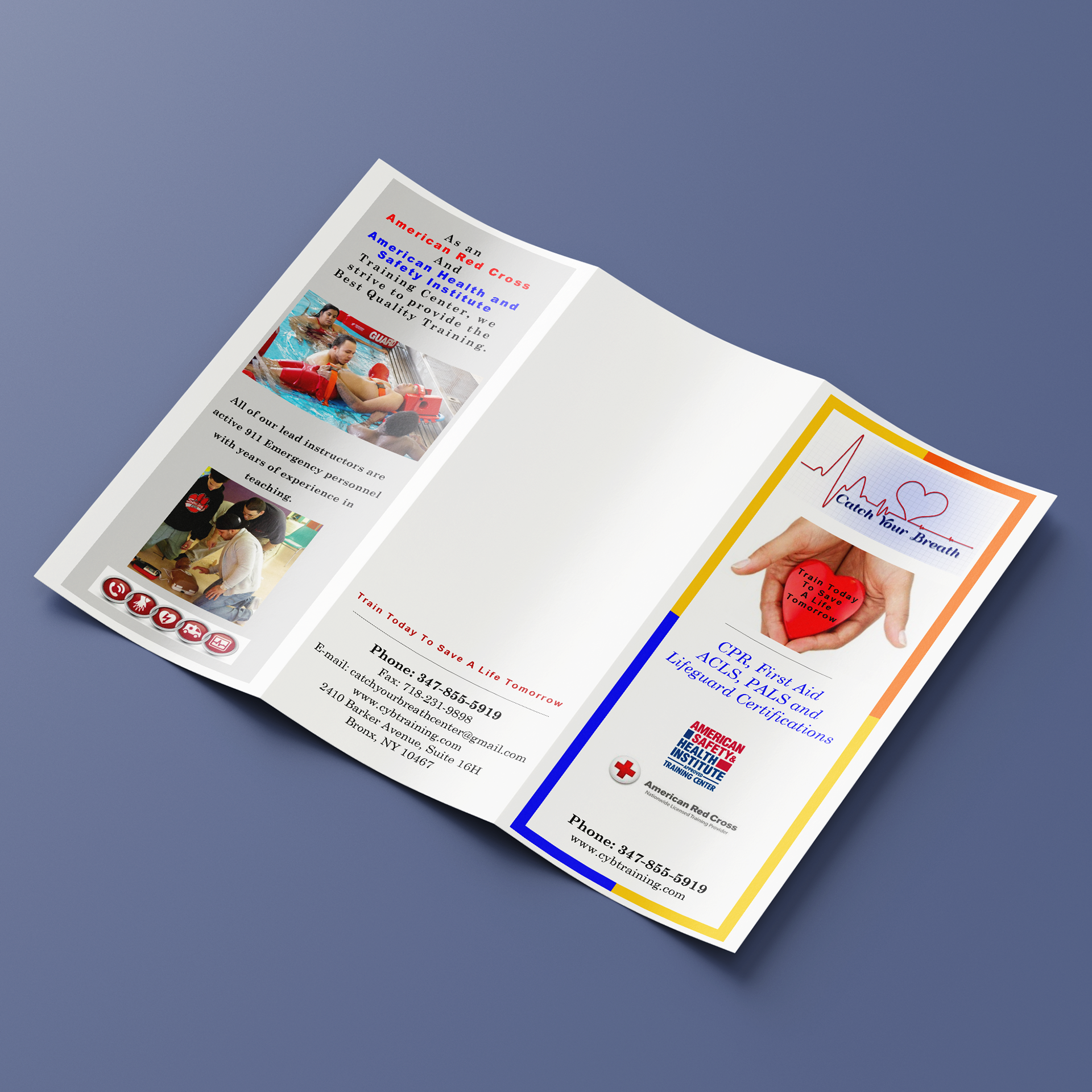
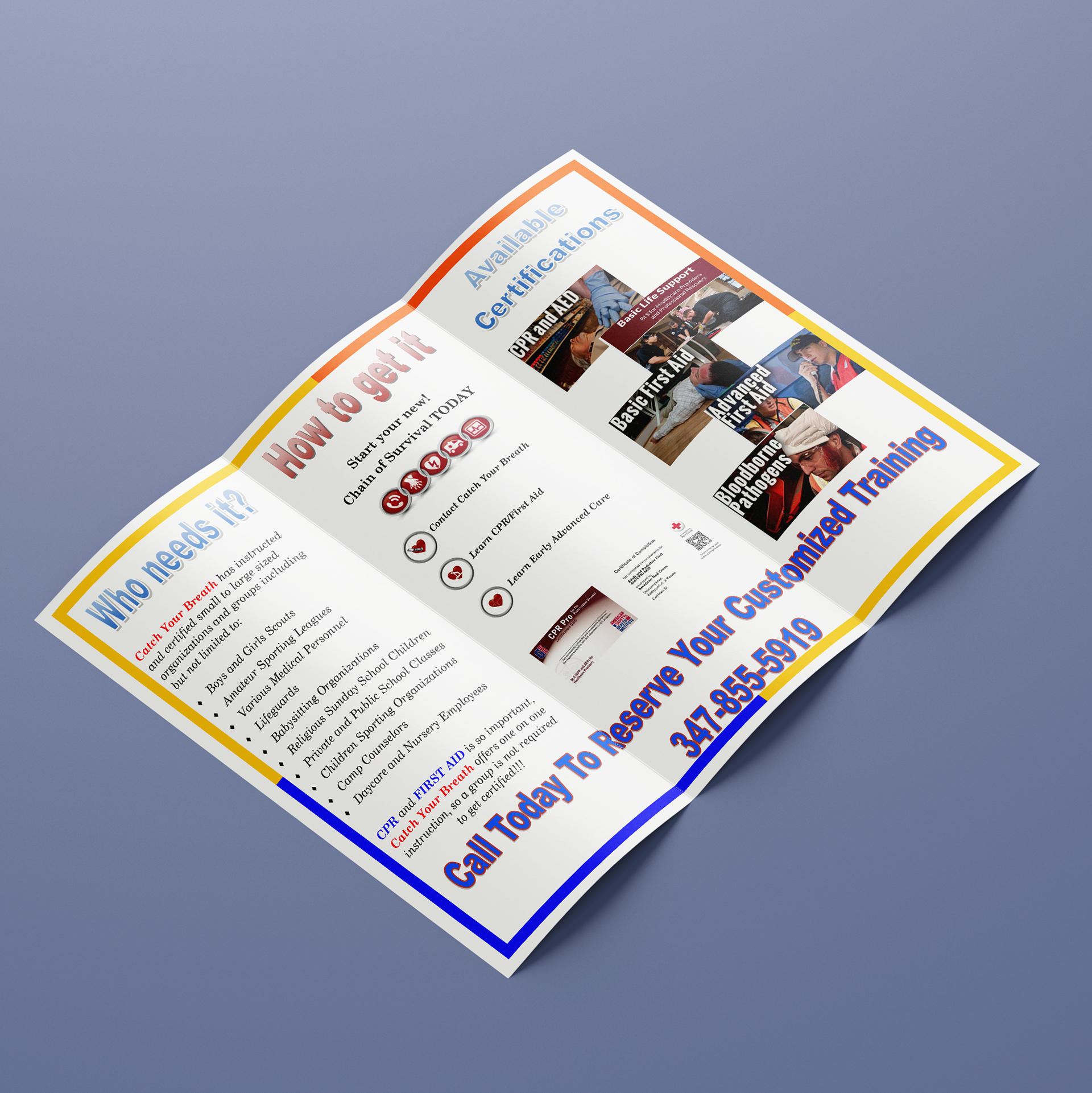
The client required a brochure for a bi-annual mailing that would showcase upgraded graphics and branding. Unfortunately, the client had previously been provided with low-quality images for their logo and outdated graphics, and was now seeking improved graphic standards to reflect their growing business. The original brochure design was disorienting due to the use of too many fonts and colors. This project was a crucial first step in establishing the client's unique brand look and feel, as it would provide valuable information for the creation of content across their other marketing streams.
I began by reworking the logo and building the brochure and content around the new colors and form. I simplified the EKG by turning it into a heart icon with a thick rounded EKG line going through it. For the company name, I used the font Montserrat, and decided to use it for the rest of the piece. To make the tagline easier to remember, I shortened it to "Learn to Save a Life" from "Learn Today To Save A Life Tomorrow". I created two variations of the logo: red and black, and a white logo.
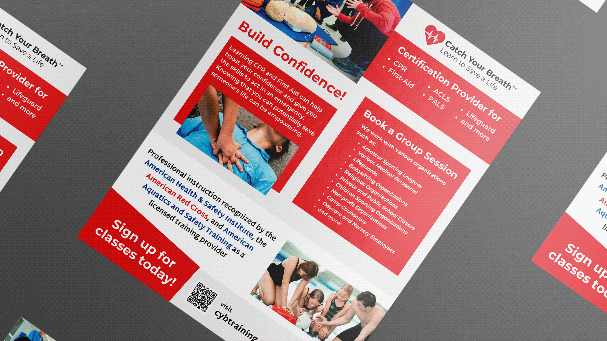
In the brochure, I used the same colors from the logo as the main background color and type. I used secondary colors like grey and navy for the background and type. I reorganized the content to tell a unified story. The cover displays some of the main services the company provides to capture interest. As you open the brochure up, you learn about the company story and all the certifications you can receive from Catch Your Breath™. Finally, the full inside page shows you how you can sign up and the range of groups this company provides services for.

